UX Marathon
From one-woman show to scalable learning platform
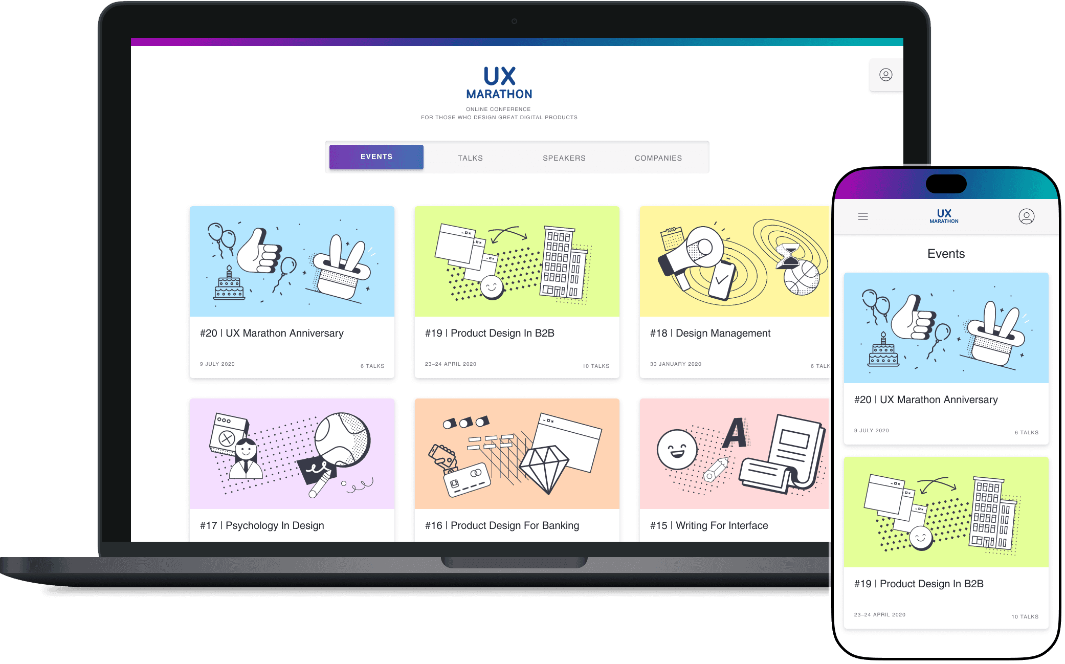
Before 2020, UX Marathon was just a series of live events for UX specialists. I led the design for its first digital platform and changed scattered content into a structured and easy-to-navigate learning experience. By collaborating closely with the founder, I transformed the live-only format into a scalable product with lasting value.
Key Results
1,000 - 2,000 live participants per event
3,000 - 4,000 video views in the first month
UX Marathon has become one of the most influential UX learning platforms in the Russian-speaking market during the pandemic growth wave
my impact
Designed the entire platform from scratch, from information architecture to user flows, navigation, layout, and content presentation
Created a systematic, user-centered experience that allowed thousands of designers to discover, search, and learn from a growing video library
Designed for scalability: the platform now hosts over 200 talks, with monthly updates and 2,500+ site visits per month
Team
Product Designer — I was the sole designer and project coordinator
Founder
3 developers (backend & frontend)
Timeframe
May – December 2020
UX Marathon: Filling the Gap
In Russia, the product design community was missing something important:
a conference that truly fit their needs.
Designers were looking for an event that:
Happened multiple times a year
Was affordable and easy to attend
Skipped the fluff and focused on hands-on knowledge
Featured speakers with real, practical experience
UX enthusiast and entrepreneur Alexandra saw this gap and started organizing quarterly events that quickly built a strong and loyal following.
Context
There was no central platform: event links, recordings, and certificates were scattered across different tools. The founder was overwhelmed by manual requests and repeat questions.
Please send me a link to the event.
How do I join today’s session?
At the same time, the founder saw a clear opportunity: offering paid access to an archive of 100+ recorded talks.
Our goal was to build a scalable learning platform — a single place where UX professionals could join live talks, browse past content, and manage their participation with ease.
My Role
As the only product designer on the project, I worked closely with Alexandra, the founder and conference host, to bring her vision to life. I joined as a volunteer during the early days of the pandemic and took full ownership of the user experience, from discovery to delivery.
With no product or development team in place, my role quickly expanded beyond design:
Led end-to-end UX and UI design for the new platform, based on user research
Helped build the project team from scratch sourcing freelance developers and aligning timelines
Facilitated collaboration between design, tech, and the founder to keep the project moving
Brought structure and product thinking to the process, helping prioritize features that mattered most to users
This hands-on role let me influence not only the product, but also how we collaborated to deliver it.
Uncover Friction
Creating a journey map helped us clarify the full user flow, from signing up to watching talks and getting a certificate.

It surfaced key gaps and shaped our design priorities:
No email structure yet: I defined the purpose, content, and timing of reminder and follow-up emails, and supported Alexandra with visuals and copy.
Core website touchpoints: I identified what users needed most and mapped out the key areas to support them:
A public landing page with event info
A live event page behind login
An archive with talk recordings and materials
A certificate page for participation proof
Tool coordination: We had to connect multiple tools (e.g., streaming, mailing, backend) into one seamless experience.
This early mapping work aligned the team and laid the foundation for a focused MVP.
To make better product decisions, I paired the founder’s vision with research insights. We needed to validate assumptions and focus our limited resources on what users truly needed most.
What I did
Analyzed participant feedback from past events
Conducted user interviews to understand motivations and frustrations
Ran a competitive analysis of edtech and online learning platforms
What we learned
Most of our assumptions were confirmed. Users’ top priorities were:
Clear event information and easy payment, covered via a well-structured landing page and timely emails
Reliable access to the live stream
Certificates of participation
A structured archive of past recordings and materials
We also discovered an important insight: Many participants didn’t pay out of pocket — their employers covered the costs. This revealed a second stakeholder group: HR teams and design leadership.
To address this:
We created a “convince your boss” sheet participants could use to explain the value
We introduced business-friendly packages to make bulk or repeat participation more attractive for companies
This helped us shift from a one-time event mindset to a more strategic, scalable offering, supporting both individual learners and design teams.
From Design to Delivery
To ensure technical feasibility, I worked closely with our freelance developers from the beginning. I shared interactive prototypes, discussed user stories, and provided specs to make implementation smoother.
To speed up development and maintain consistency, I created a lightweight design library with reusable components. This library served as a single source of truth and helped the frontend developer implement the UI faster and with fewer questions.

Solution & Results
We launched the first version of the platform in summer 2020. It arrived just in time for the next online conference, allowing full streaming and management through the new system.
For the first time, participants could register, purchase tickets or video packages, and access everything in one place: live talks, past recordings and certificates.
Due to tight timelines, some processes, like generating certificates, remained manual at first. In parallel, we were still fixing early bugs and technical issues. To stay responsive, I added a feedback form to the platform and made sure users had a direct line to our developers. It wasn’t a perfect setup, but it allowed us to resolve problems quickly and maintain a smooth experience during live events while showing users that their feedback truly mattered.
We made transparency a central part of our strategy and this open communication paid off.
Many participants were designers themselves and understood the challenges of building digital products under pressure. By treating them as collaborators, not just customers, I helped build lasting trust and loyalty within the UX community.


Mobile Experience
Early user research showed that many participants accessed the platform on mobile devices, often while on the go.
To ensure a smooth experience, I prioritized mobile-first design from the start. From landing pages and registration to video playback and certificates, every key interaction was optimized for small screens. This included fast loading times, clear typography, and easy one-thumb navigation.
This focus on mobile usability made the platform accessible wherever users were, whether at home, at work, or commuting.


Next Steps
In the next months, we continued to improve and expand the platform. We fixed bugs and improved performance based on early user feedback. We also reached out to new user groups, including conference speakers.
I designed a self-service area for speakers to upload talk info and update their profiles. This significantly reduced manual coordination for the founder.
I created reusable design assets and templates, allowing the team to build consistent landing pages and marketing materials on their own.
Reflection & Learnings
This project taught me a lot about building digital products from scratch, especially in resource-limited, real-life situations. Starting without any research budget or development setup was a challenge. It pushed us to think lean and stay practical.
One important lesson was how to gradually bring in user research, even when a founder has a strong vision for the product. By combining early assumptions with interviews, surveys, and usability tests, we made the platform more relevant and accessible for our users.
As the de facto team lead, I held the product and the people together, while owning the end-to-end product design.
This project also shaped my leadership style: hands-on, calm, user-focused, and always looking to move forward together, even when things get complicated.